New Logo
More than just a symbol – we’re making a statement
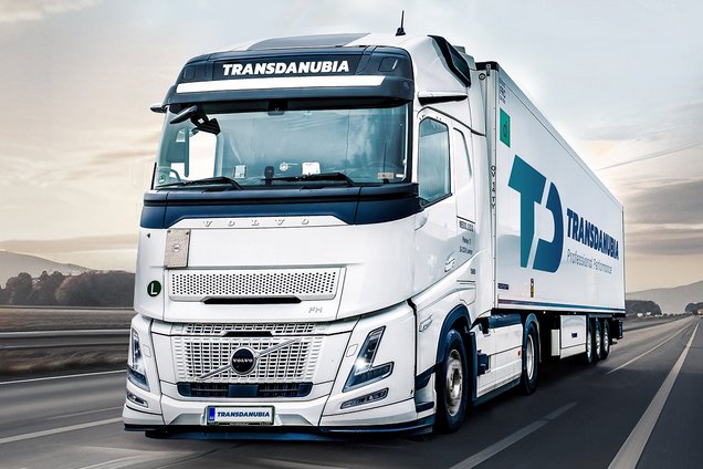
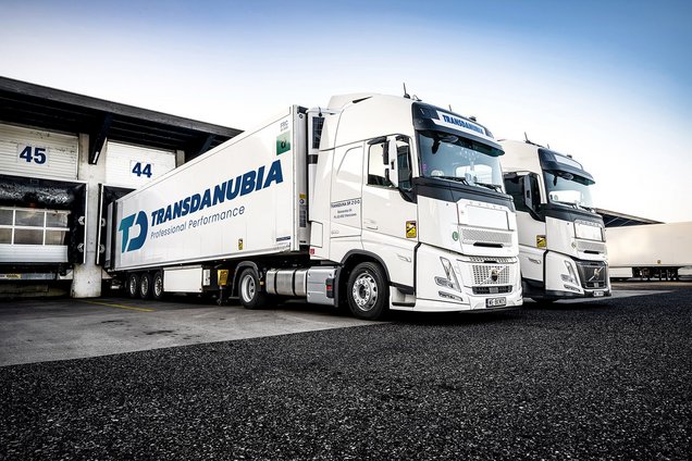
The past months at Transdanubia have been all about renewal, reflection, and further development. Behind the scenes, we have been working intensively on a project that goes far beyond a purely visual update. Today, we are making an important step visible to the outside world: our new logo.
In an industry that is constantly moving, standing still is not an option. Logistics is evolving rapidly and demands flexibility, innovation, and foresight. Our new logo is therefore not just a cosmetic adjustment, but a deliberate step forward—a visual expression of our ambition to continuously develop, connect, and grow.
The logo forms the heart of our new brand world. Our previous visual identity has accompanied us faithfully for decades and helped shape us into the brand we are today. The new logo design now strengthens the message we want to convey. It stands for movement, dynamism, and clarity. Its clean lines and modern design perfectly reflect our international environment and our drive for continuous development. The color concept represents the diversity of our services and our people.
At the same time, the new logo remains true to our values. Reliability, professionalism, and commitment continue to form the foundation of our actions, and these principles are also reflected in the new design.
For our customers, the new logo—embedded in a broader communication strategy and corporate identity—means greater clarity and consistency. Our positioning and services become more understandable and tangible, clearly showing what we stand for and who we are.
With this new logo, we are opening a new chapter. It represents our ambition to keep evolving and to actively shape the future of logistics together with our customers.